Description
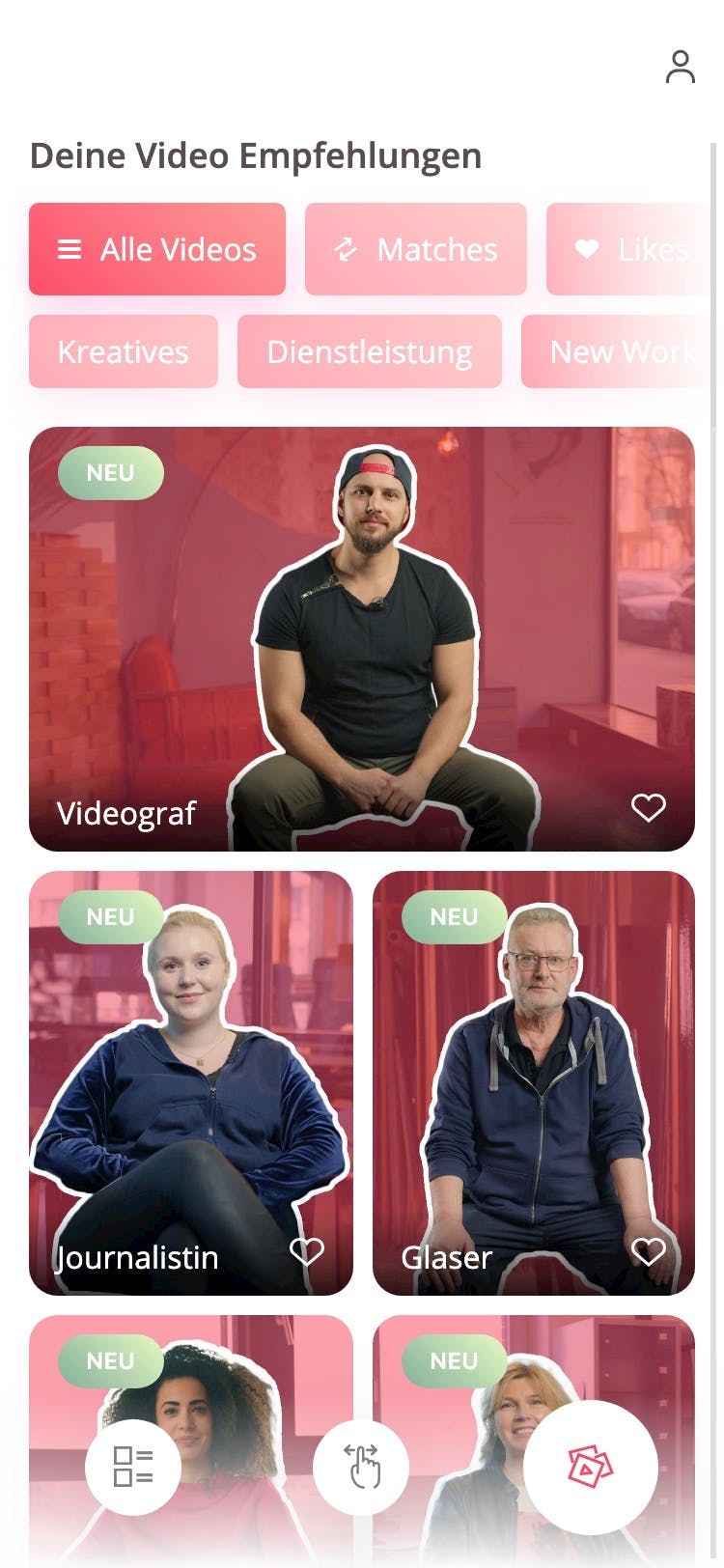
For a startup, we designed and developed a web application that offers high school students insights into various jobs in the form of videos.
Services
- MVP Conception
- UI/UX Design
- Development
Technologies
- Next.js
- Contentful
- Firebase
- Ionic
The Challenge
The client approached us with the idea of building a digital job orientation platform. With no more than a few presentation slides, that conveyed the rough idea, our mission was to flesh out the idea, bring it to life as a mobile-first web-application and ultimately solve the business case assigned to us in the short timeframe of 2 months.
UX Design
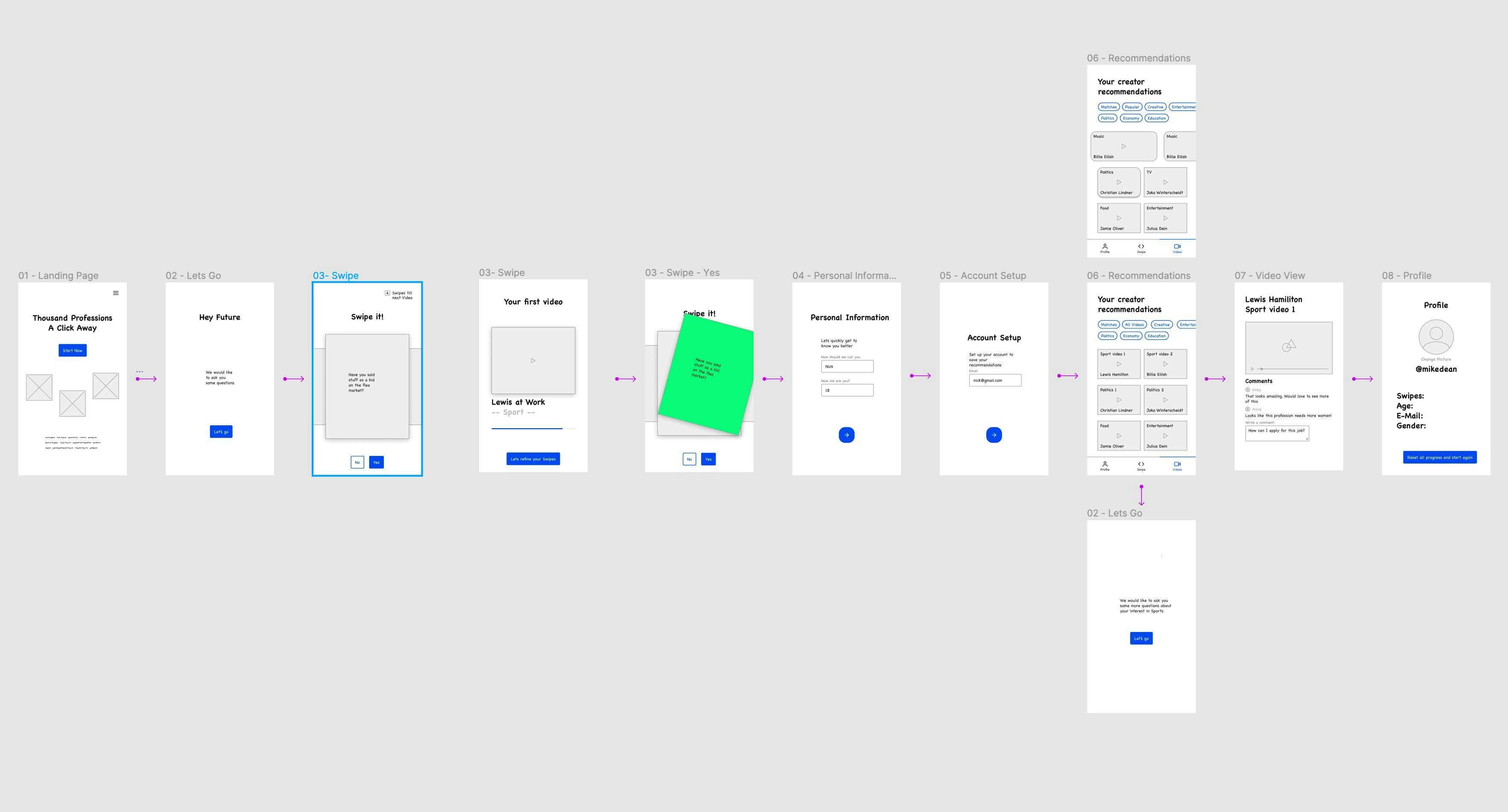
In a continuous discovery process with the client we advised with our industry knowledge about user interests, behaviors and best practices. We challenged ideas, systematically separated the good ideas from the bad and iterated over the user journey to then break everything down into the following:
- Users signup for an account by answering only the most basic informations about themselves to avoid drop off rate during the process.
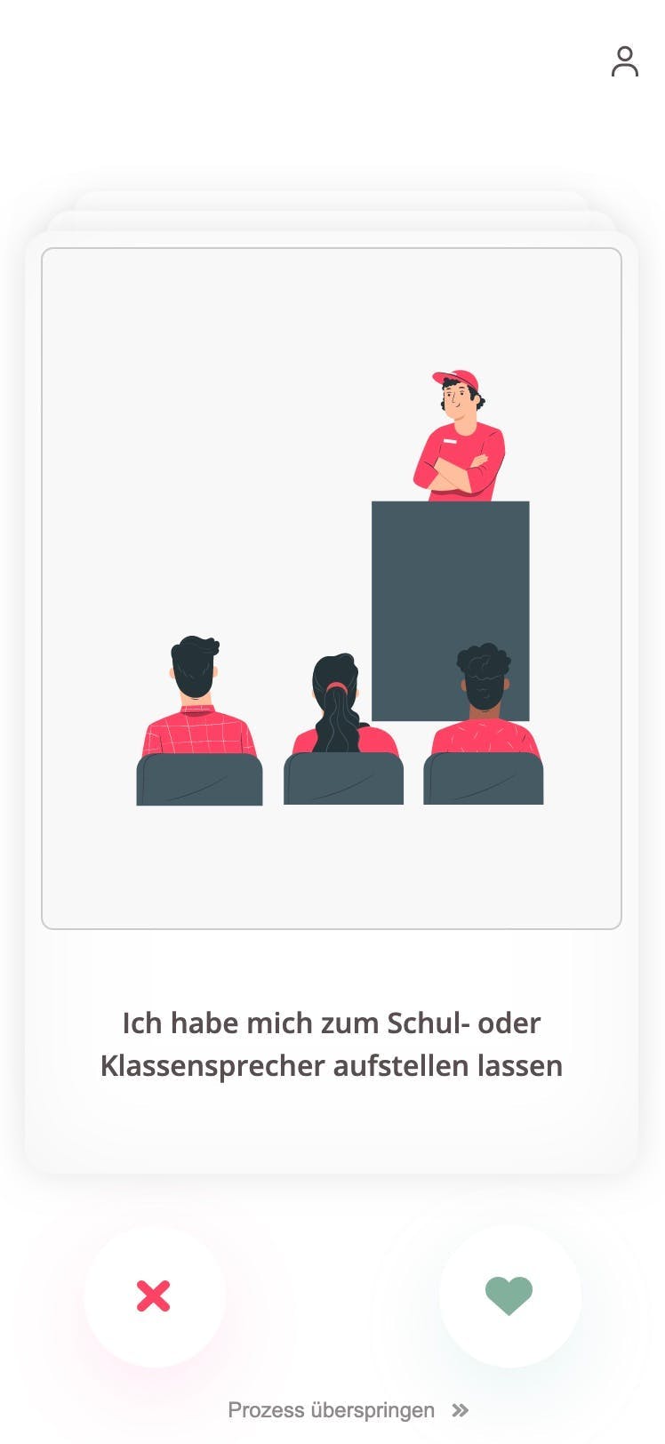
- Users then agree or decline personal and job related questions on cards by swiping them left or right.
- After completion users can access recommended videos based on their given answers.
- In these videos, people from a specific industry give insights into their profession and career.
- Users can get into discussions with the community below the video.
The result of this UX design process were low fidelity wireframes that constituted the first clickable prototype.
UI Design
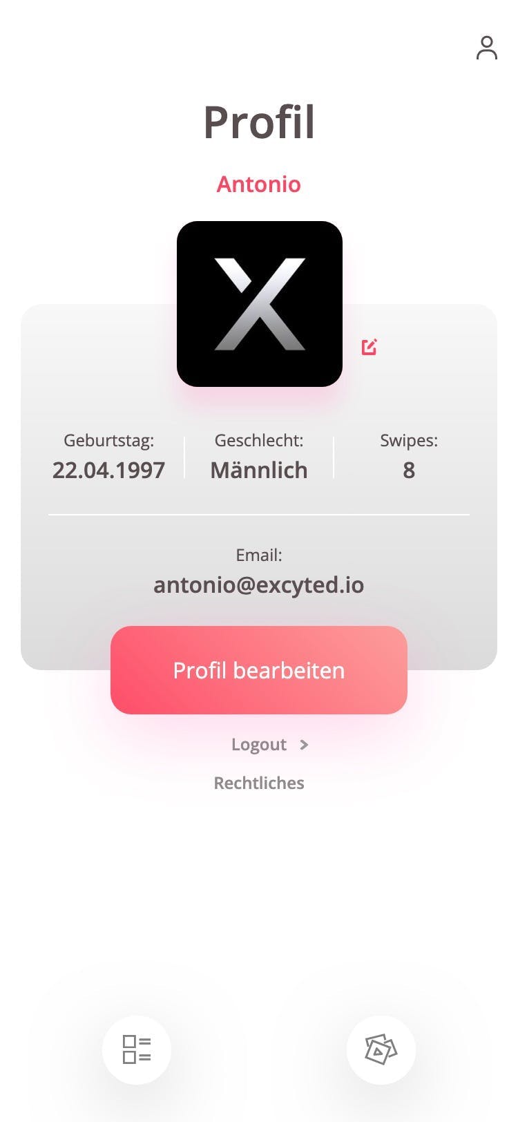
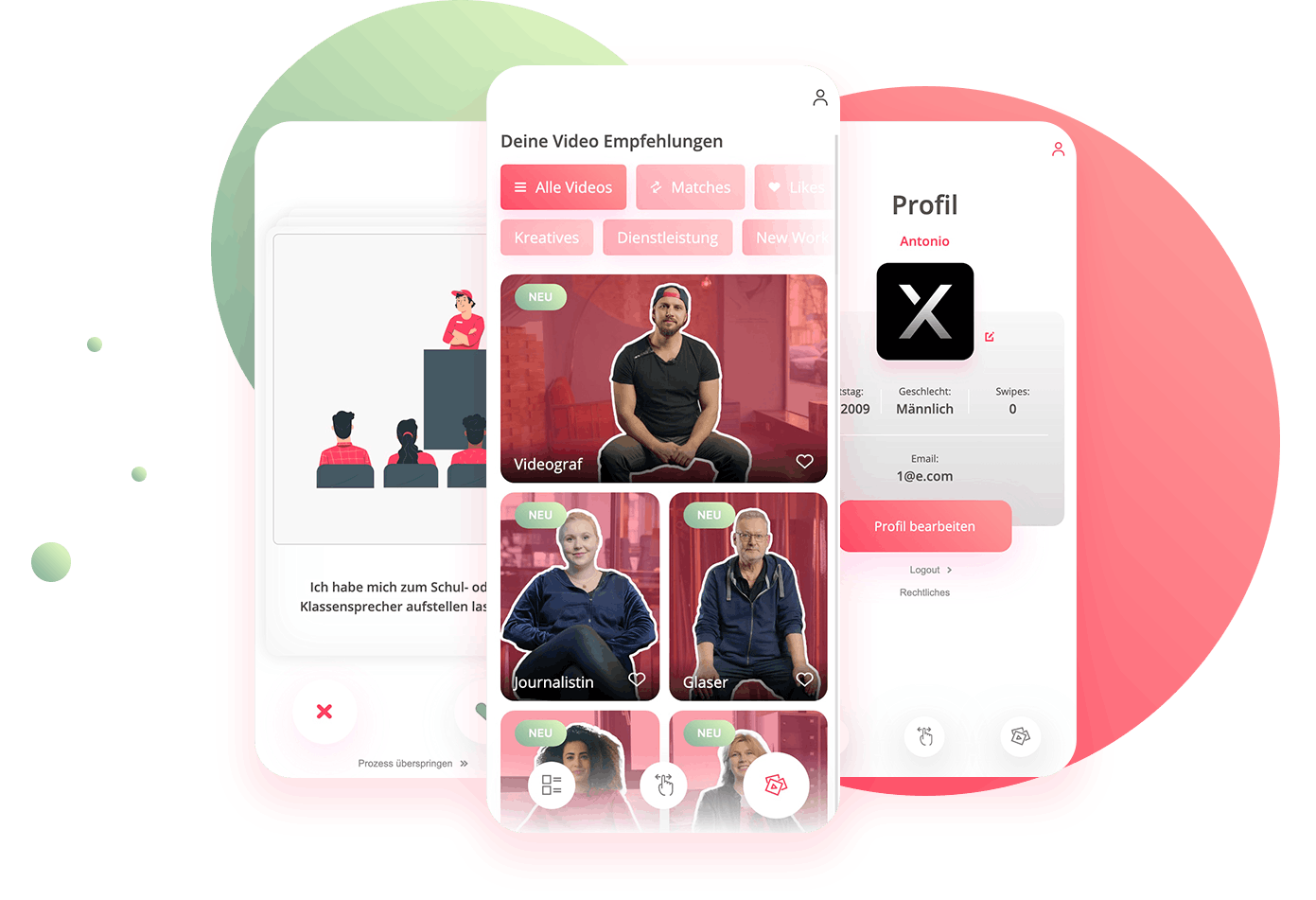
With our wireframes in place our goal was now to design the real interface of the app with all its details and speak the language of the brand. Our goal was to surface the product to our earlier defined student in a clean, simple and intuitive way.
To focus on clarity and consistency we kept the design clean and simple with two main colors and reoccurring elements.
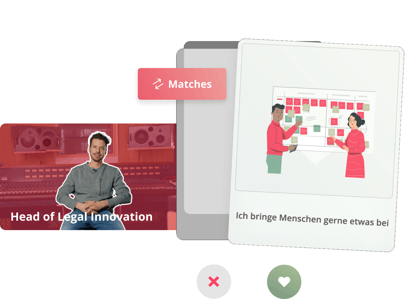
Interactive elements like swiping cards and comments were supposed to feel familiar and intuitive to use and were therefore based on established apps like Tinder and Instagram. Like hearts, speech bubbles and filter buttons were designed in a way that invites users to interact in a playful way with the product.
Development
Main ideas revolved around a decision based swiping feature with an intelligent matching alogrithm, a recommendation video library and a realtime chat.
Architecture
The app architecture is built with the javascript framework NextJS on the frontend and Firebase on the backend. We chose this stack because it allows for rapid scalability, speed and easy maintenance.
CMS
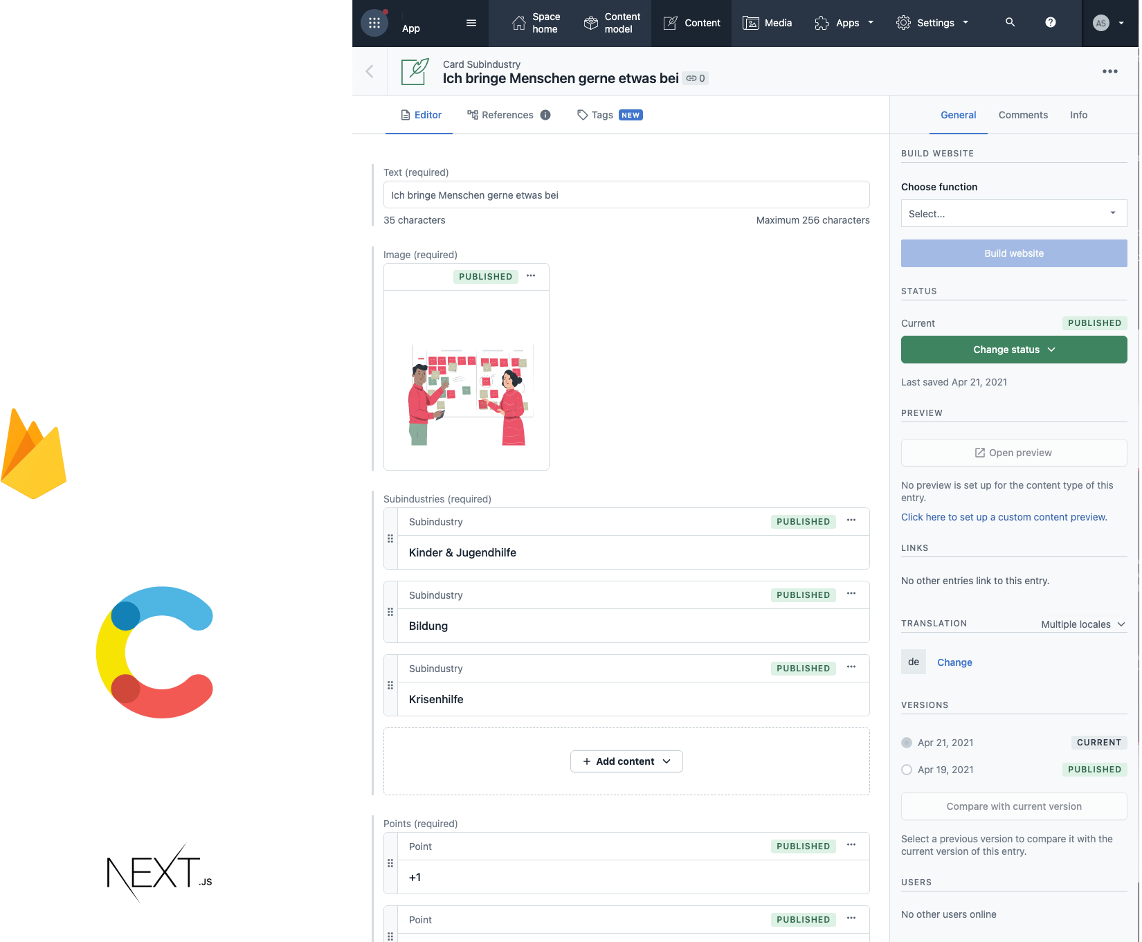
With the integration of Contentful as a content management system the client can not only easily add content like questions and videos but also classify and customize the uploaded content to influence how it is matched with users interests.
Matching algorithm
We developed a matching algorithm that intelligently matches users answers to specific videos the user is likely to be interested in. Questions and videos are weighted against a user's answers and can thus be sorted by most matching interest
Real time chat
To foster in-app engagement and communication we integrated a real time chat feature that allows users to read, post and like comments below a video. Users get immedieate response on their comments and those of others.
Continuous Deployment
The app was set up in a way that makes continuous development and deployment as easy and fast as possible. Through the separation into a staging and production environment, new features and content can be tested before it goes live to the public. Our powerful backend-solution makes deployment of new versions and hosting fast, safe and reliable.
Screen shots
